Here are some of the design trends that we are seeing a lot of as 2018 rolls along. Before you run out and re-do your website, sites can look as amazing as possible but if they don’t load quickly, have easy and obvious functionality, none of that design matters! Also looking at the examples below you can see that no single idea is an all-encompassing fix to an outdated site. You can’t do most of these trends without also doing the minimalist trend or they will be cluttered and unusable. And you can’t get away with minimalist without a compelling image or copy line to balance it out. Do your research and really get to know your user and that their needs are when visiting your site. That is where you may find a nugget of valuable information that you can take and really blow out into a concept for a beautiful and functional website.
Broken Grid Layouts
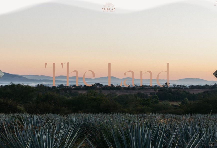
This one may seem a bit haphazard, but don’t try this at home unless you know what you are doing. As they say ‘you must learn the rules before you break them,’ and that definitely applies here. You must understand the grid before you break it. This new trend of diverting from the regimented grid style layouts of traditional sites to a freer form experience may look unstructured, but it has to be well thought-out to really work. And when it does, it makes a responsive site flow more seamlessly between screen sizes because they are generally set up in such a way that overlapping is part of the design. It also gives a little more breathing room to focus on the content.
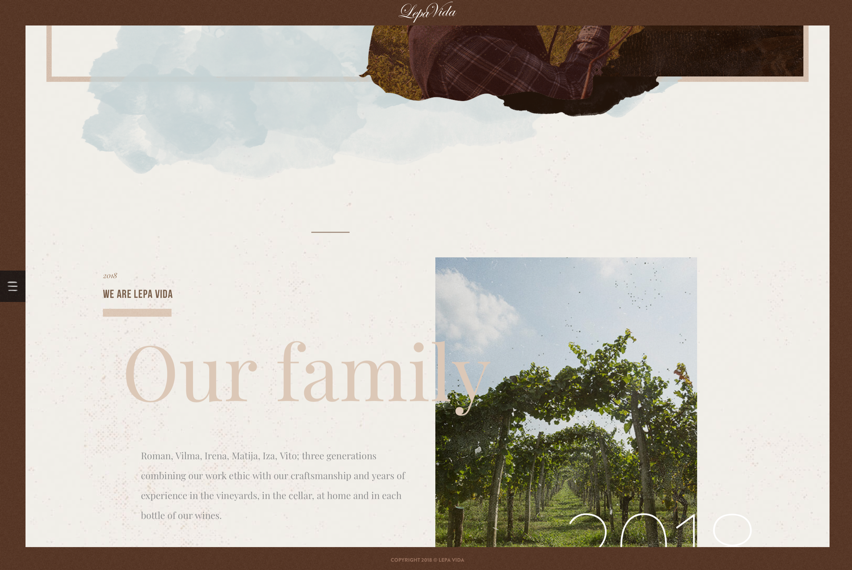
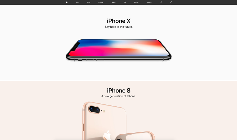
Minimalism
OK, we know. Minimalism isn’t a new concept. Apple has been doing it for years with their streamlined product designs, the minimal mid-century modern and Swedish furniture design trend is huge right now, and there is even a movement to live minimally by getting rid of everything except your utmost essentials in your home. So, it is only natural that minimalism makes its way into web design. We know that it can be a scary prospect for clients who naturally want to get in as much information as possible, but in the age of information overload, it is refreshing (and actually liberating) to create sites that rely on simplicity of messaging and design. It adds to the user experience and allows the brand to truly shine through. When you start with a solid strategy (like we do), it is easier to get to this less-is-more ideal.
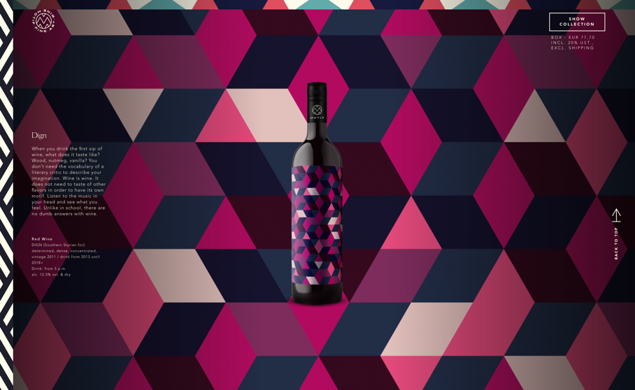
Bold
Go big. Go bold. Bold design can encompass many things such as pattern, color, size, font, etc. but what makes it really work is using calculated restraint. Focus on one or two bold elements and scale back other elements to balance out your design and keep the user engaged (not overwhelmed).
http://www.kraftmacandcheese.com
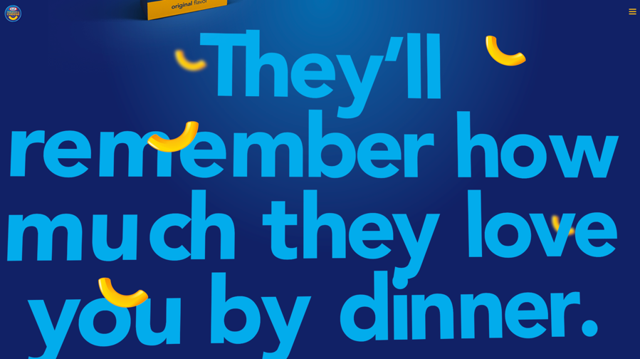
Motion
In the age of YouTube, virtual reality, 360° media, electronic devices everywhere and short attention spans, a static site sometimes isn’t enough to engage the consumer. Any opportunity to add a hint of movement to an object will further bring the site to life. Add elements of movement to your design such as cinemagraphs, hover effects, parallax scrolling, and icons animating. These little touches go a long way.
https://www.rainforestfoods.com/experience